OUGD502 - Studio brief 01 - Adobe XD
OUGD504 : Studio brief 02 has introduced me to new software which is the Adobe XD beta, through using this software I was able to design and prototype a web app within the same software which is incredibly useful. As the brief asked for prototypes that are working, animated or navigable, XD allowed me to effortlessly prototype the web app unlike After Effects would, even though I had a number of useful AE workshops for the brief which have helped further my knowledge of AE; it doesn't offer the same ease as XD.
As XD is a beta its still being developed so it isn't the finished product and this provides difficulties sometimes when using it, for example resizing images can be strenuous at times and the type tool can often be annoying but other than that its a rather simple software to use, the easiest Adobe software to navigate in my opinion. Using this software created enjoyment throughout the design process as I was both new to this software but also digital design, it created enthusiasm for digital design as I believe being able to prototype the work at any time was beneficial to both me as designer and the process. Comparing this to design for print, in which prototyping work can be time consuming and costly like OUGD504 : Studio brief 01.
Thursday, 29 December 2016
Monday, 12 December 2016
OUGD504 - Studio brief 01 - Swot analysis
For a small task set in a PPP lecture we had to note down a swot analysis of ourselves.
Strengths
For a small task set in a PPP lecture we had to note down a swot analysis of ourselves.
Strengths
- Positive working attitude
- Remain up to with current Graphic Design
- Adaptable
Weaknesses
- Communicating ideas
- Creating a broad range of ideas
- Picking the first idea that comes to mind
Opportunities
- Opportunities for myself at this stage of my practice include placements
Threats
- A saturated market of designers so I need to find a unique selling point of myself
OUGD502 - Studio brief 01 - Plæy Workshop exhibition of its identity and brand concept @ Colours May Vary
I recently attended the opening night of Plæy workshop at CMV, Plæy which is a newly launched furniture and homeware brand which studio Build created the identity for. Build creating the identity happened to be the main attraction for me to attend plus the free beer of course.
Michael C Place of Build worked with the Plæy's founder to develop a name and identity for the new brand so that it “launched with a strong foundation,” the logo and icon mirror the brand’s approach to its products, with a simple, modular and playful design that can adapt as the company develops. The icon uses geometric shapes to form an abstract face, giving personality to the identity. Similarly the workmark and typography conveys a fun persona for the brand with its rounded letter forms at different levels. When examining the logotype I guessed that the use of the 'Æ' which is commonly used in Scandinavian language is to communicate a simple message, similar to Scandinavian design and lifestyle. Overall I like the identity of Plæy as it is adaptable and easy on the eye, the use of the rounded custom typeface make the brands personality come across extremely well and makes it stand out from others. The night itself was good as it was a chance to meet other creatives as I recognised a number of LCA Graphic Design students from third year and recent graduates.


Thursday, 8 December 2016
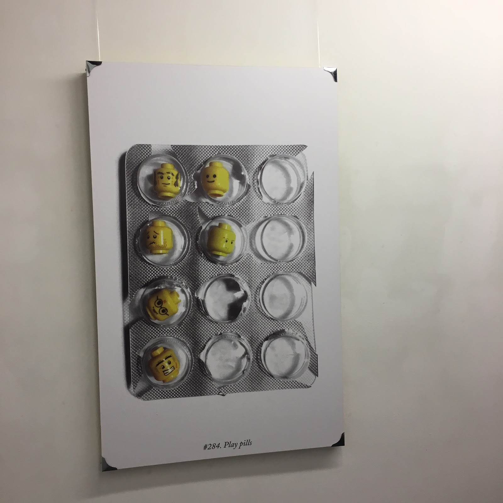
OUGD502 - Studio brief 01 - Everyday objects @ Munro House
I recently visited Everyday objects by artist Jason Tyler at Munro House, the small exhibition is a topsy turvy re-imaging of everyday objects found in our homes. Tyler created a piece of artwork a day in 2012 and the outcome was hundreds of tinkered, adapted, and changed objects. The artwork is witty and playful in my opinion which made me question how easily some of pieces were constructed, for example placing a lego head onto a toy solider may seemed like such an easy / obvious response when I was viewing it yet I would never have adapted the two together when I was younger. Through this the exhibition definitely achieved it aims of making me reimagine objects little and large that have been a big part of my life at some point.


I recently visited Everyday objects by artist Jason Tyler at Munro House, the small exhibition is a topsy turvy re-imaging of everyday objects found in our homes. Tyler created a piece of artwork a day in 2012 and the outcome was hundreds of tinkered, adapted, and changed objects. The artwork is witty and playful in my opinion which made me question how easily some of pieces were constructed, for example placing a lego head onto a toy solider may seemed like such an easy / obvious response when I was viewing it yet I would never have adapted the two together when I was younger. Through this the exhibition definitely achieved it aims of making me reimagine objects little and large that have been a big part of my life at some point.

Monday, 28 November 2016
OUGD502 - Studio Brief 01 - Thornville Haus
Introducing Thornville Haus, a personal project from myself and my housemates of Thornville Road. This idea all started off one day when we found ourself bored so we set the challenge to design a poster in under three minutes, once the three minutes were up we revealed our designs and we believed that a brewing concept was behind it all and took the oppurtiunity to start Thornville Haus. We created an Instagram account to spread the posters online and we try to add a few designs weekly, but the rules have changed a bit since we set it up as we no longer design them under three minutes. The concepts behind the designs are not to be taken seriously as we give our own spin on trends, events and happenings in our humble abode such as the boiler breaking and leaving us with beyond freezing showers for three days.
At this stage we are just enjoying stepping away from University work for ten minutes or so to let something else occupy our mind, Thornville Haus allows us to express and explore our own styles in any way we want without having restrictions in a humorous way, thats what makes it so enjoyable. We've lightly discussed how we could take it further in the future by maybe making a publication of all the posters or even hosting our own exhibition showcasing the best designs.


OUGD502 - Studio brief 01 - Collaboration
Recently I helped out a fellow LCA student with a photoshoot, the concept behind the shoot was a unconventional cookbook which helps students. The style in which they were shot was a simple composition paired with a pastel colour palette. My job during the collaboration was just helping out with the layout of the food as a photography tutor recommended that my fellow peer focused on graphical shapes to inform the composition of the food so I was asked to help, almost art directing in many ways. Also working in a photography studio environment was personally helpful as I also got the chance to use a Phase One camera which I'd never used before.


Recently I helped out a fellow LCA student with a photoshoot, the concept behind the shoot was a unconventional cookbook which helps students. The style in which they were shot was a simple composition paired with a pastel colour palette. My job during the collaboration was just helping out with the layout of the food as a photography tutor recommended that my fellow peer focused on graphical shapes to inform the composition of the food so I was asked to help, almost art directing in many ways. Also working in a photography studio environment was personally helpful as I also got the chance to use a Phase One camera which I'd never used before.


Friday, 25 November 2016
OUGD502 - Glug event
"Fuck London", "It's not all about London" These were the frequent outcries from the recent Glug Leeds event I attended which was all about championing Leeds and the norths creative talent. Each talk resounded each other by stating that London is great but the real creativity and passion is 'Up Norfff '. The night started off with a talk by Studio Builds creative director Michael C Place, for me this was the main attraction of attending the talk as I find Builds work inspiring and very much so a studio I'd love to see myself being a part of, so it was interesting to see where Michael started from and how he got where he is today.
The introductory slides, which for starters I found inspiring already as he started his presentation with a quick dash video of all the work Build produce, I noted this down as a possible way to present my work for the end of year presentation as it cuts out many slides and gives a brief insight into work without giving too much dense information. He used acronyms and a slick contemporary typeface for the titling of the presentation which gave the presentation itself a strong visual identity which helped engage the audience beyond norm, well for me it did. He then went onto to talk about what first got him interested in graphic design at a young age, early recognition were pieces of Iron Maiden album artwork as he found the type fascinating and still does as he believes it holds a contemporary stature thats stood the test of time. Even though he found the Iron Maiden artwork fascinating he still didn't understand what made him intrigued by the type until one day his school friend introduced him to a Letraset catalogue, and this is where the love for graphic design started.
As he got older other influences included Neville Brody, Rod Clark and Music and this happens to be what he went into after graduating from Newcastle College where I studied for two years. At the time designing music sleeves was a big industry and one that paid well he stated but after a number of years in London and 9 years at the Designers Republic in Sheffield designing album artwork the work become tedious and the demand was decreasing which I assume was down to the emergence of the internet which effected the music industry massively. Michael decided take a break and travel the world for year then returning to London in 2001 to set up Studio Build, Build has went onto becoming a famous and acclaimed studio which recently moved to Leeds as Michael said himself at the Glug talk 'that everything we need is here and Leeds is great'. His talk was inspiring as his love for music echoed my love for music and it was insightful to see how he has incorporated music into his work throughout his career, he then finished the talk with the message 'Have a wide spectrum of work'.
Other talks during the night were from Studio12, She does digital, Alec Dudson from Intern and Only studio. I enjoyed the she does digital talk as they touched upon the booming digital demand in Leeds which is relevant to the current OUGD504 brief. According to reports, 3,500 digital businesses are in Leeds and employing over 72,000 employees which is encouraging for digital design and graduates in Leeds. Overall I really enjoyed the Glug event as it gave me a chance to get an insight into a studio I pay close attention but also to see other creative work across other spectrums like the Studio12 which was about filmmaking and app design.

OUGD502 - Study task 02
This study task started with a lecture talk titled 'Whats the big idea?'.


This study task started with a lecture talk titled 'Whats the big idea?'.
- The idea you come up with is a strategy, the concept and proposal.
- Think about the product, range and distribution.
- The best creative solutions are achieved through open mind thinking.
As a smaller task we had to note down ways in which we create ideas as individuals.

The main task we had for this session was creating two ideas for a past YCN brief in which you had to make Yahoo! the worlds most popular homepage. In a group of three we read the brief, highlighting key words and aims of the brief then we went ahead with brainstorming ideas for Yahoo!, we tried to stick to the list of idea generation skills we previously made in the session to quickly come up with the ideas in a short time.

Idea one
A playful and engaging hub that adapts to your personality, the target audiences love of social media will be integrated into the hub offering quick and easy access to Facebook, Twitter and Instagram which will optimise the users experience and let them fully engage with social media. Personal touches such as recommendations popups which showcase website that relate to your recent search history for example "Hi Tom, we noticed you recently visited Uniqlo for a spot of clothes shopping, why not try out this similar website?", having these personal touches such as recommendations will optimise the users experience while on Yahoo! but the experience isn't all about when your actually on the hub, the hub never sleeps. You may close the hub but this wont stop it subconsciously searching for your needs, it'll recognise popular searches and interest then update you of its results; almost like a personal report. What makes the hub personal is its attention to yourself as a user, it'll pick up on language and tone of voice and replicate it to make visiting the hub enjoyable and most of all, to make it the worlds most popular homepage.
Idea two
The specific target audience is 13-18 years old so as a group we asked ourselves what is important at this stage of your life? The gap may seem small between 13 and 18 but a lot change happens in a young persons life at this stage. We noted down social, education and employment as three main factors of a young persons life and after a brainstorming we decided upon employment to base the homepage off. Finding a job at this age is a daunting task, for many people it may just be a part time Saturday job or a full time job for a school leaver but the problems they face are often the same. Where do I look? How do I write a cv? Who's employing at the moment? these are just a handful of questions asked by youngsters eager to get a foot in the door. So the answer is that Yahoo! turns all its attention to a homepage that is specially designed to getting you a job, more laid back than LinkedIn but the same end result.
Sunday, 20 November 2016
OUGD502 - Studio brief 01 - Valuing my work & Student Bite Logo
Recently I was contacted by a close friend about one of his friends at university who required a logo for his Business project. I was open to produce a logo for him as after initial talks about what he wanted, he added that the work would be paid. At this stage I was unaware of the payment as he had to discuss it with his group first, but I had the figure of £20 in my mind as I put into context that they were students such as myself so funds are low. Recently I had a lecture on how to value my work and thanks to this talk I was able to put into account ways in which to value my work, first of all my time had to be accounted then my skill set, as he already informed me of what he wanted then no research was required; if it was then I'd have to charge more than £20. I felt £20 was a fair price for the service I was providing and if they weren't students then I'd be charging much more.

As you can see above he offered me £5, which I found funny in all fairness. I understood that the group are students and funds are low but I'm a student myself and cant afford to offer my time cheaply. I contacted back telling him my price and within a day he was able to pay the price. He specified that he wanted a black, mustard yellow and dark green colour palette with type layered 'Student' then 'Bite' below it with a chef hat at the top. He made it evidently clear what he wanted, so I took it upon myself to create the logo in Illustrator which in total took me roughly 40 minutes to make.

The logo which I produced is nothing I'm entirely proud of, in fact I dont like it all but its what he specified and he was happy with the end result so this was an example of supplying the client with exactly what he wanted. If I had more time on this and was able to research and put my own spin on the logo then I believe the logo would come out much differently.
Wednesday, 16 November 2016
OUGD502 - Studio brief 01 - Only talk
We had a visit from award winning design and strategy studio Only, it was an interesting talk as they initially started by talking about common misconceptions of digital design and how people often think you have to code to be a digital designer, when you don't. 'It's not proper design' and 'its boring' are other misconceptions of digital design, Only made it clear that digital design gives the designer endless opportunities to create and allows no restrictions due to a constantly evolving area of design.
Digital design is now the primary way of consuming a brand as its the first point of contact, Only showed us their phases when producing a digital solution to a brands needs. The first being research, looking into the user of product and creating personas is a crucial part of research as many times it gives the answers to the problem. After research wireframes are mocked up to give the designer a feel of the work and to get a rough idea of what it'll look like in sketch form, then once this is completed Only develop these in the design process. Front end and testing follows to complete the stages, learning how a digital design studio work was helpful as it'll help me plan out my work for this brief.
Once the talk was finished they allowed the class to ask a number of questions, one of my peers asked the question 'Does the studio have an overall aim when creating a piece of work' the response was that Only create digital responses that are accessible for all audience and that anyone can access the content, so this would be classed an aim of the studio. I took this on board as an aim of my own for OUGD504 : Studio brief 02 as I want to create something that is available for all. Other helpful things I learnt from this talk was that space is important when creating digital designs because it helps you distinguish content more and Adobe have an app that allows you to view design on your handheld device.
Thursday, 10 November 2016
OUGD502 - Studio brief 01 - OUGD504 : Studio brief 01 / Evaluation
Firstly this brief has allowed me to further my knowledge and practice in editorial design, this is something at this current stage in my practice I am extremely interested in and keen to further in my studies. In previous editorial design briefs, Ive never had to fully consider the audience and production of a book as I have in this brief, so studio brief one has allowed me to look at editorial design in a different scope. This has made me research differently and approach certain processes with more of a informed decision behind them, rather than designing something that is aesthetically pleasing with no underlying concept behind it.
When I was mildly briefed for this studio brief back in May, when as a class we were told to shoot type in context. My first interpretations of the brief were that we had to shoot the individual characters of the alphabet from A-Z, so I took the opportunity while in Amsterdam over the summer to shoot images for the brief. This was the first benefit of the brief as it allowed me to collect my own content for a book, something I didn't do much of in first year for editorial projects. I came away from Amsterdam with a string of images I was proud of, and happy they fitted the brief description of type in context within a certain location. Once I returned back to LCA in September I was fully briefed, and at first I was worried as I thought the images I collected were wrong and couldn't be made into a fully fledged concept for a book. After some initial thoughts into a concept I decided upon 'Amsterdam is misinterpreted by youth', from there the brief started for me as I was able to undertake some crucial research that would heavily inform the design and production of the book.
Research into book and publications was enjoyable for this brief, as for the first time I was looking at them from a different perspective. Looking at target audiences and why they've been produced like they have really inspired me and opened my eyes to the informed decisions behind design that is heavily influenced by the target audience. Researching into dutch design was profitable for the brief itself but also my personal practice, looking at inspirational studios and designers like Experimental Jetset and Wim Crouwel engaged me on a personal level which made the research more enjoyable.
When it came to the production of the book, I enjoyed putting the content into place in Indesign and stylising the book informed by the research. The design of the book was influenced by the Stedelijk Museum in Amsterdam but the outer design of the book (cover and bag) was designed in a way to catch the target audiences eye in a humorous manner. Each process was informed and I particularly enjoyed the screenprinting onto plastic bags process, as this was experimental and I wasn't entirely sure if the process would work but the final piece looked as I planned and received positive feedback. Learning how to use different equipment like the power guillotine and learning new things about commercial print in research was a valuable part of the development of this book as It allowed me realise my previous mistakes I'd made in past projects when coming to print the final piece.
In production I did come across a number of hiccups, including the cutting of the book. For the first test print I decided to use a stanley knife to cut the paper, as I rushed this process I accidentally trimmed it wrong which meant I couldn't perfect bind the book to test how it looks. This mistake seemed to repeat itself when I used the power guillotine for the first time, I forgot to place the pages in order which meant I accidentally cut page numbers off. These mistakes proved to be very expensive mistakes as I had to print the book four times to get it how I wanted it but one positive from this was I learnt from each mistake and learnt new skills along the way. I am happy with the finishes and process I went through as I know they were relevant to my concept, if I was to produce a book about the rich type of Amsterdam then it would a necessity to produce the book to a high standard in terms of finishes and binding, but on the other hand my book is about youngsters solely having the view of cannabis and the red light district when they think of Amsterdam so a cheaply produced book which attracts that audience is suitable.
Overall I am happy with the final book, I know if the book was to be commercially printed then a lot of things would be different but as it was produced with what I've got available here at LCA, I believe it is successful and desired. What I most enjoyed was the process of linking research and production continuously throughout the brief to produce a final piece that can be desired by a target audience.
OUGD502 - Studio brief 01 - Upcoming events
Claire Holdstock : Periphery @ Assembly House 24/11/16 - 26/11/16
An exhibition of clean edged architectural assemblages constructed from plastic sheets, concrete and plants. Claire constructs addresses high modernist design whilst alluding to the peripheral spaces in our cities.
Sweetshop @ Hyde Park Book Club 19/11/16
This event explores new outcomes for sustainable issues, designed to mix elements of sustainability with art, music, fashion and film in an interactive space.
Everyday Objects @ Munro House 1/12/16
A re-imagining of everyday objects that reside in our homes by designer Jason Tyler.
Wednesday, 2 November 2016
OUGD502 - Studio brief 01
Last year in my personal and professional end of year presentation I highlighted that in second year I wanted to increase my online presence for the chance of my work getting more exposure and possibly networking with other creatives. It was around May when I set up a personal Instagram design account, through Instagram it made it easy to reach out to other like minded designers and creatives who may like my work, initially I just wanted this to be a platform to showcase my work but as it developed it was a way of communicating and appreciating with other creatives.
 Now I'm in second year the account has grown considerably due to work being uploaded and being recognised but the one piece of work that kickstarted it all was OUGD406 Studio brief 04, in which I had to create a response that would help the incoming first years to the course. My response was a nightlife freshers visual guide which informed freshers of the best clubs to visit in the city, I chose this as it was a big problem of mine when I first moved to Leeds. The guide was stylised in a modernist illustrative style, I illustrated each club in a line drawing style then designed the guide in a modernist grid. Personally I was very pleased with the end resolution for this brief, so I decided to shoot product shots in a studio then upload them to my Instagram account.

The response from this upload increased my followers overnight resulting in enhancing my online presence, I tagged each club which informed them of what I'd done. The first to repost an Illustration was Belgrave Music hall and Canteen, with Belgrave having 16 thousand followers it gave the illustration a wide audience unlike my own Instagram account did. Other reposts on Instagram followed, with Headrow House, Wire Club and Canal Mills all posting the illustration to their feed with links to my account. Another benefit from this was surprisingly making money, I was privately messaged with a request for a print of Belgrave. So I screen printed a small number of Belgrave prints and sold one for 20 pound, this was a new experience for me as I didn't know how to measure the price of my own work.
I was in contact with the people at Canal Mills and Wire, exchanging emails etc and letting them use my artwork as long as I was credited. Wire went onto using the illustration as a profile picture on Facebook as well as printing the print, and placing it in their head office. Akaplate was an account which showcased innovative graphic design uploaded an image of my work, the account doesn't exist anymore, most likely because they never credited the designer. Although it annoyed me that they took my work without asking or crediting me, it was still encouraging for a design account to appreciate my work.
Thanks to my Instagram account Ive been able to enhance my online presence massively over the last six months, and hopefully in the next six months it'll be even bigger.


Last year in my personal and professional end of year presentation I highlighted that in second year I wanted to increase my online presence for the chance of my work getting more exposure and possibly networking with other creatives. It was around May when I set up a personal Instagram design account, through Instagram it made it easy to reach out to other like minded designers and creatives who may like my work, initially I just wanted this to be a platform to showcase my work but as it developed it was a way of communicating and appreciating with other creatives.


The response from this upload increased my followers overnight resulting in enhancing my online presence, I tagged each club which informed them of what I'd done. The first to repost an Illustration was Belgrave Music hall and Canteen, with Belgrave having 16 thousand followers it gave the illustration a wide audience unlike my own Instagram account did. Other reposts on Instagram followed, with Headrow House, Wire Club and Canal Mills all posting the illustration to their feed with links to my account. Another benefit from this was surprisingly making money, I was privately messaged with a request for a print of Belgrave. So I screen printed a small number of Belgrave prints and sold one for 20 pound, this was a new experience for me as I didn't know how to measure the price of my own work.
I was in contact with the people at Canal Mills and Wire, exchanging emails etc and letting them use my artwork as long as I was credited. Wire went onto using the illustration as a profile picture on Facebook as well as printing the print, and placing it in their head office. Akaplate was an account which showcased innovative graphic design uploaded an image of my work, the account doesn't exist anymore, most likely because they never credited the designer. Although it annoyed me that they took my work without asking or crediting me, it was still encouraging for a design account to appreciate my work.
Thanks to my Instagram account Ive been able to enhance my online presence massively over the last six months, and hopefully in the next six months it'll be even bigger.


Thursday, 27 October 2016
OUGD502 - Study task 01
For this study task I had to identify and evaluate my experiences on the course to date
5 things that I have learned so far on the programme ?
For this study task I had to identify and evaluate my experiences on the course to date
5 things that I have learned so far on the programme ?
- Graphic Design terminology, before first year I had no previous knowledge of Graphic Design at all, so learning key terminology has been a big learning curve for me.
- Indesign is a software which I'd never used before university, Photoshop, Illustrator and Cinema 4D are all softwares I was comfortable with at college but I never got the chance to experiment with Indesign at that level. Now I'm in second year I feel at ease with Indesign, as I consider it my favourite piece of Adobe software.
- Skills in time management has been a part of my learning here at LCA, being able to juggle numerous briefs at the same time is a skill I believe.
- Graphic Design theory, as I was totally new to Graphic Design I only ever considered the practical side. The theory behind it never crossed my mind but thanks to context of practice I've been able to look at Graphic Design in a different scope to form my own opinions which is a skill.
- One of the best and most enjoyable things I've learnt is traditional print methods such as screen printing. Once I grasped the process I was able to include this printing method into my university work alongside personal work.
5 things I want to learn more about ?
- Editorial Design is something I'm incredibly interested in so I want to learn even more about this while on the course. Whether or not I see myself specialising in this within the field of Graphic Design is to be seen, but at this stage of my practice I'd like to learn more.
- To extend my theory of Graphic Design, through context of practice I'm hoping to form a question for my essay and relate it to my personal interests, but with it having a strong link to Graphic Design theory.
- The current industry, while I'm on the course I want to learn about the current Graphic Design world out there, so once I graduate I'll be prepared.
- At this stage in the course I have not undertaken much work in Branding, this is something I wouldn't mind trying my hand at.
- Exploring other methods of Graphic Design that I'm not entirely interested in such as packaging.
- Illustrator is definitely a skill of mine I believe is a strength, I've been using the software for nearly four years now but still learning new stuff, so it is a skill I'm only getting better at.
- I like to keep very much up to date with current Graphic Design through blogs etc, through this I'm able to adapt which I consider a skill.
- I consider myself versatile in terms of work I can produce
- Idea generation
- Editorial design
- I want to improve on presentations
- Speaking about my work in confidence
- One aim for this year is to improve in context of practice, through more engagement I believe I can improve in this module.
- Collaboration
- Networking
- Number04
- Yasseen Feik
- Studio Spgd
- The Designers Foundry
- Fabian Fohrer
- ItsNiceThat (cliche)
- Resident Advisor
- Kiosk
- Grafik
- Bloggerrrrrrrrrrr
Thursday, 13 October 2016
OUGD502 - Studio brief 01
In the first PPP session of the year I've been asked to analyse what I struggled with in first year of the course, especially things I highlighted as a struggle in the PPP presentation at the end of the module. When looking back to first year and the challenging points I encountered, what comes to mind is managing my time and presentations. To start with time management, I really struggled at the start of first year with juggling various modules at the same time and due to this certain modules such as context of practice was affected. I prioritised studio practice modules over context of practice which led to me being less interested in the theory of graphic design, I felt I never engaged during the sessions which led to a poor overall context of practice grade which brought my end of year overall grade down. This is disappointing and regretful on my behalf but now I look, I seen what I done wrong and can hopefully improve my time management in second year to accommodate all the modules. A way in which I can do this, is delegating individual days to solely work on a particular module. By doing this I won't be distracted by other work and the module wont feel fragmented to me as it did last year when I was too quickly interchanging between modules on a daily basis.
My other challenging point of last year was presentations, I'm not the only one as nearly everyone gets nervous before public speaking but what I seem to struggle on is talking about my work in confidence. I understand my own ideas and concepts but sometimes find it hard to present them to people who are totally oblivious to them. This can be annoying for a number of reasons because I don't receive the feedback I need, plus it makes me doubt my ideas at points. I feel when I'm presenting something other than my ideas, I'm fine and feel confident in front of people.
Ive already started a way of helping myself talk about my work this year, I simply note down key words or sentences about my work rather than a talking about the overarching concept as a whole. I feel like people use the key words and piece together the idea themselves, I find this technique helpful because it makes the audience ask more questions as sometimes I find myself sat in presentations and the idea goes over my head, due to an intricate description of the idea that sometimes is unneeded.
Saturday, 5 March 2016
OUGD402
International contemporary artists book fair
I recently checked out the International contemporary artists book fair at the Tetley, I thought the fair would be helpful for my current brief in design principles, as it is producing a book. What I gained from this visit was looking out for any unique folds or binding techniques that I could possibly use in my designs but I also found the layout of the exhibition / fair useful too, as I will be hosting an exhibition as a part of my course in May, so to see how work is presented in a certain space was helpful. Sadly I wasn't able to purchase any books due to my current student financial situation, but a number of them did catch my eye and it was an opportunity to engage with the artists.


Sunday, 28 February 2016
OUGD402
Screenprinting induction
Recently I had an induction into screenprinting, personally this has been the most helpful induction to date as before the induction I was unaware of how to screen print but it was also helpful because I currently have a brief upcoming in which the final resolution has to be a screen print. Previously I thought that screenprinting was a complicated printing method but the induction assured me that its rather simple, just the cleaning and set up of the screen itself is time consuming. Overall I enjoyed the induction and now feel confident screenprinting, as I'll be using the printing room more and more for uni work along with personal work.


Saturday, 27 February 2016
OUGD402
Lord Whitney studio visit
Recently as a class we visited Lord Whitney studios for a talk about the 'connoisseurs of make believe' Amy Lord and Rebekah Whitney's story, from Leeds Beckett university to art directing a Nicki Minaj music video. The start of the talk was all about letting us know how they set up, I found this the most interesting and inspiring part of the visit as the two only knew what they truly wanted to do, one week before finishing a three year course studying Graphic arts & design. This was encouraging because it made me realise that I don't have to worry about what I want to specialise in once I'm on the course because once I leave university I might take a complete different path in graphic design like Amy and Rebekah did. Even though Lord Whitney don't exactly specialise in graphic design but set design, they talked about how they are always eager to take on new and challenging projects. This was another encouragement as maybe I need to step outside my comfort zone to achieving doing work in other disciplines.

Wednesday, 24 February 2016
OUGD402
Studio Brief 01
Photography lighting induction
This latest induction into the facilities available at college was personally very helpful to my practice, firstly because beforehand I was unsure on how to use the lighting equipment such as the lamps but also how to set up all the equipment available but now I know, I'll certainly be taking advantage of this facility more because I'm eager to photograph my own work in a professional manner and this was a part of the induction as I had to bring along some of my own work to light then capture.


Friday, 19 February 2016
OUGD402
Number 04 Studio
Number 04 is a studio I came across recently when I was influenced by the editorial in Hypebeast magazine, which they design. I decided to do further research into the studio, to see other projects and the processes they follow as I was drawn into the style.


The studio was set up by Davis Ngarupe and Jordan Haynie but the studio itself wasn't the initial idea, they started a design club called Internet Explorers as a way of establishing a community and working on personal projects after work. But after a few months they decided to plan and produce these projects full time, So created Number 04 as a type of studio / publishing imprint where they could take on commissioned work and create consumer products. Based Utah, the designers at Number 04 believe they are in a good place due to the mix of people in arrears to the universities. When I was looking at the archive of work at Number 04 I took onboard that the work crosses disciplines and is very varied, they like taking on projects where they can explore format and approach every project that every design element is subject to change.
I checked out the available interviews with the studio, and the designers say themselves that they are impatient when it comes to process, always thinking about two projects ahead, in some ways this reminds me of myself as I tend to plan ahead while I'm currently half way through a project.
I'll continue to keep up to date with Number 04 work as I'm incredibly interested in all the diverse work produced by this studio, I'll also continue researching into studio and will contact them to gain a better understanding of other process they have along with inspirations of they're own but at this time I need time consider a focused set of questions to ask that will benefit me.
Thursday, 18 February 2016
OUGD402
Binding & Monoprint induction
Recently I had workshops in book binding and mono print, in both Ive learned new skills as prior to the workshops I'd never done either. In the bookbinding session I produced three varied types of books, all made using different binds and stitches

Firstly the bookbinding workshop was very useful, even know I only learned three ways of binding, from that I learnt the basics which will serve me well in future briefs. Before I had the workshop I most likely would of been slack when it came to binding my work and picked the easy option of stapling but now I know numerous binds, I'll be able to apply them to my work.

The second induction was in mono print, which was another first for me. I really enjoyed this workshop because it made a change from constantly being sat behind a computer screen. It gave me an opportunity to be more hands on with my work and enabled me to think about more ways in which I can use this printing method.
OUGD402
Studio Brief 02
Branding style inspiration
Stepping away from the the Instagram final outcome idea inspirations, I needed to look at other personal branding that related to my concept, I needed to design an icon / logo, have a tone of voice that resembled my personality and overall a style that is communicated through the Instagram feed. So I looked into other personal branding that is similar to my style.


OUGD402
Studio Brief 02
Instagram Influences
For some research and inspiration I delved into Instagram accounts that I follow to gain a better understanding of what makes them successful. My personal Instagram is a mix of my practice within graphic design and my personal life, but for the personal branding account I want solely focus on graphic design. When I was looking into other accounts relating to graphic design, whether it be an individual or studio, they all seem to keep it simple and make the work posted the focus. The work posted to my account will be my own to gain exposure but also work that currently inspires me.


As you can see the designers or studio normally have a small icon / logo then a small bio. This will all be apart of my branding, as I need to consider the tone of voice, and how I'm presented just through the small bio.
OUGD402
Studio Brief 02
Concept development
Following talks with my peers and further thinking about my personal branding concept, I've decided to change the final outcome of my personal branding. At the beginning my plan was to have a website but now when I consider the benefits of this, I don't think a website is the right choice at this stage of my practice. For a website to be successful you need a certain amount of coverage, not just online but in the physical world. The other options online are, Facebook, which was good for a certain time but lost its cause and isn't the right platform for exposure. Twitter is predominantly word based and graphic design can only say so much. Instagram is the perfect balance right now for graphic design interest and personal perusal, it allows greater expression of one personality than Tumblr and easily captures what you're all about.
I think Instagram is the perfect balance for my practice at this time, by using an account I can expose my own work along with showing other work I'm interested in, following the eye to eye concept I have.
Thursday, 4 February 2016
OUGD402
Secret 7
I've been briefed on my latest brief as part of OUGD406 Design practice, the brief is to produce album artwork as a part of Secret 7. I believe I'll enjoy this brief personally, firstly because I'm interested in the link between music and graphic design but mainly because its a live brief. Previously when I've took part in live briefs in the past, I find myself more motivated to produce work as it will be displayed in the 'real world' of graphic design and provides the opportunity of my work to be noticed by others. So personally I think this brief will help me to really consider my processes behind my design and to visually and conceptually exploit every possible angle of your ideas.
OUGD402
Fontsmith type specimens
Earlier in the year I contacted Fontsmith type foundry about the possibility of them sending me some Typeface specimens that would help my the current project at the time which happened to be typeface design. Fontsmith replied and were more than happy to send multiple type specimens to help me, I took inspiration from the layout of the specimens to give me guidance on my final type specimen, furthermore the specimens will prove a useful source on possible future briefs on typography. However, what I personally gained from all this was just emailing a professional practice, it gave me the confidence to not be afraid of making contact with studios / designers to ask for help or this case a product that would personally help me.

Thursday, 14 January 2016
OUGD402
Baltic gallery visit
Over the christmas break I visited the Baltic centre for contemporary art to check out the latest installation by Brian Griffiths, Bill Murray: a story of distance, size and sincerity. The installation is a series of nine different styled buildings, including a LA beach house, a Scottish mansion, and an ocean adventure dome but all them are styled on Bill Murray's activities and pastimes. The show encourages comparisons and differences through intimacy and use Murray's authenticity to give the objects meaning. Personally I'm a big Bill Murray fan, so I wanted to see this exhibition for myself and i found it takes Murray's characteristics as an approach for the viewer to reimagine these unique styled buildings. While at the exhibition I came across some useful wayfinding at the Baltic that helped with one of my ongoing studio briefs on wayfinding and signage, the examples proved to be a useful pieces of primary research.


OUGD402
Studio Brief 02
Initial Concepts
Eye to Eye
-Eye for good design
-Observant
-From my eye to ?
-Insight
This concept is all about my view on design and where I'm currently at in my professional practice, I want to document my projects, archive and information but also focus on my interests and inspirations 'through my eyes'. When scrolling through designers / studios websites you don't get a very good insight into what influences them so you don't often make a connection but for my idea is to have an insight into my vision of a designer and how I'm developing. Ways in which I could present this concept is through a website, but also a small editorial piece as I'm heavily interested in editorial design at this moment in time. I believe a website is possibly the best option to execute this idea because it has the widest reach for a a possible audience, and with my concept having a underlying 'blog' feel about it, its the most suitable. I'd also like something tangible to present to personify myself, a business card wouldn't be any use at this time in my practice but a small booklet / notebook could be relevant, this piece could represent me but also personally help my practice.
As far as the identity goes for this design, I want something minimal and subtle to represent my identity, a simple monochrome logo that communicates my idea of 'vision' and 'insight'.
Subscribe to:
Comments (Atom)